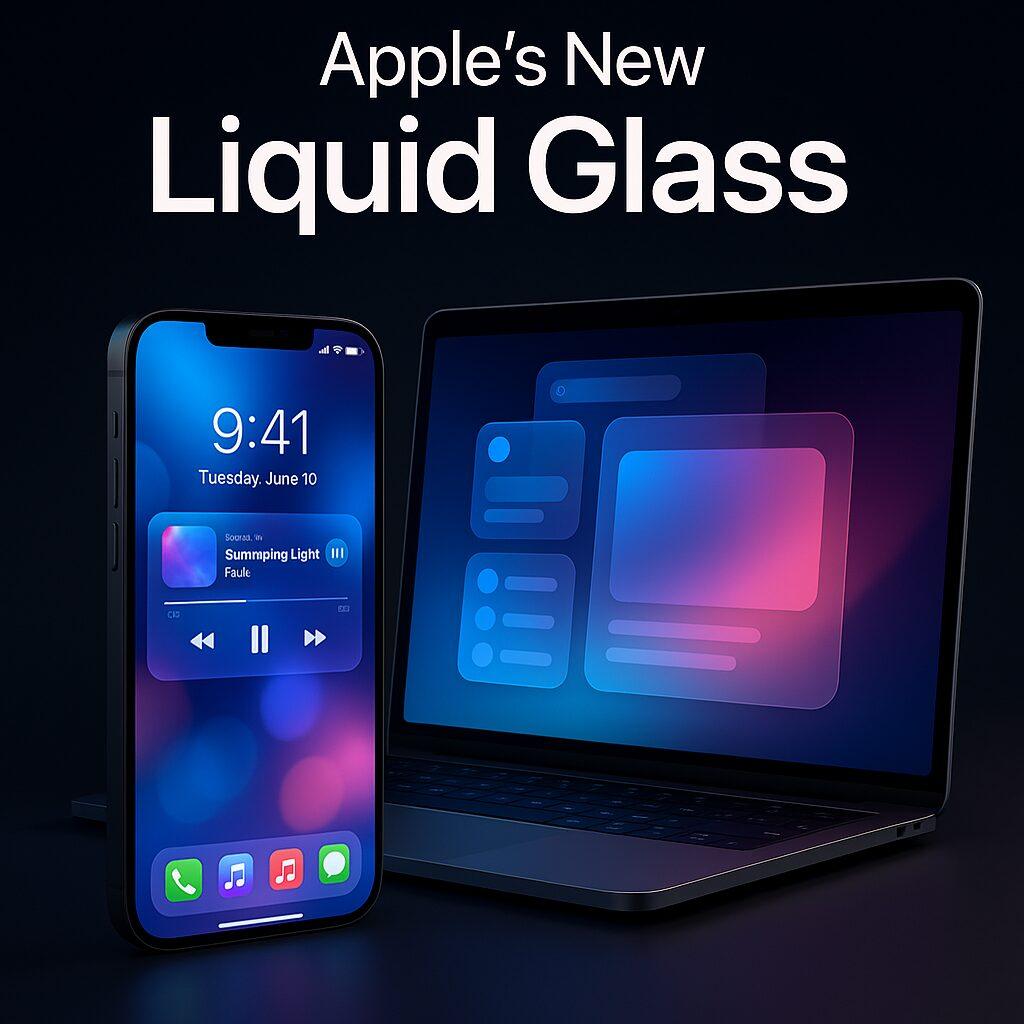
Apple’s Liquid Glass Design System in iOS 26 & macOS Tahoe: A New Era of Seamless UI
Apple has a history of reshaping how people think about user interface design. From skeuomorphic textures in the early iPhone days, to the flat minimalism of iOS 7, and the depth-driven design of macOS Big Sur, each iteration signals a larger philosophy shift. At WWDC 2025, Apple unveiled its most ambitious design evolution yet: Liquid Glass.
What is Liquid Glass?
Liquid Glass is Apple’s new cross-platform design system, built around transparency, fluid motion, and consistency. The result is a UI that feels alive, immersive, and yet unmistakably “Apple.”
Why Apple Introduced Liquid Glass Now
- Cross-device ecosystem pressure
- Rise of spatial computing
- Design fatigue with flat UIs
Core Features of Liquid Glass
Translucent layers, dynamic color blending, fluid animations, and adaptability to spatial UI.
Liquid Glass Across Platforms
iOS 26: redesigned Control Center, floating notifications. macOS Tahoe: Finder windows with glass edges. iPadOS 26: improved split-screen. watchOS 12: liquid complications.
UX Benefits
Focus without distraction, immersive interactions, and cross-device familiarity.
Criticisms & Challenges
Performance demands, accessibility concerns, and developer adoption requirements.
Opportunities for Developers
Apple’s updated Human Interface Guidelines provide SwiftUI components designed for Liquid Glass.
How It Compares to Past Apple Design Shifts
From skeuomorphism to flat to depth, Liquid Glass continues Apple’s tradition of bold design resets.
Final Thoughts
Liquid Glass is more than a cosmetic overhaul—it’s Apple’s strategy to unify devices and prepare for spatial computing. For designers and developers, it’s both an opportunity and a challenge: adapt quickly and design with fluidity.


